Loading post.
5 July 2026
Analytics dashboard
Comparing how eight local AI models describe the same photos.
Why I built it
My background is in HRIS and data analytics, where one of the tools I use is Power BI. Its signature move is cross-filtering. When the photospike left me with eight datasets describing the same 232 photos, that was exactly how I wanted to explore them. So the dashboard - built from scratch in SVG and React - works in a similar way.
What it's looking at
Each of the 232 photos carries around 40 fields: EXIF facts, categorical labels and free-text notes. Each was run through eight versions of gemma4, a vision-language model (an LLM that reads images as well as text). The eight runs cover two models - the 26b (a mixture-of-experts model: only ~4b of its parameters work on any one answer, which keeps it fast) and the smaller e4b - at two quantisations (Q4, Q8) and two temperatures (0.2, 0.8).
At the top, a model picker switches between the eight datasets. If you select more than one, the standard bar charts in the first half of the report turn clustered, a bar per model. The second half is a comparison band, scoring each model's guesses against what the EXIF already knows - for instance, its read of the time of day against the hour the shot was actually taken.
It all runs off a static JSON file, generated offline by the vision model in batches and shipped with the site.
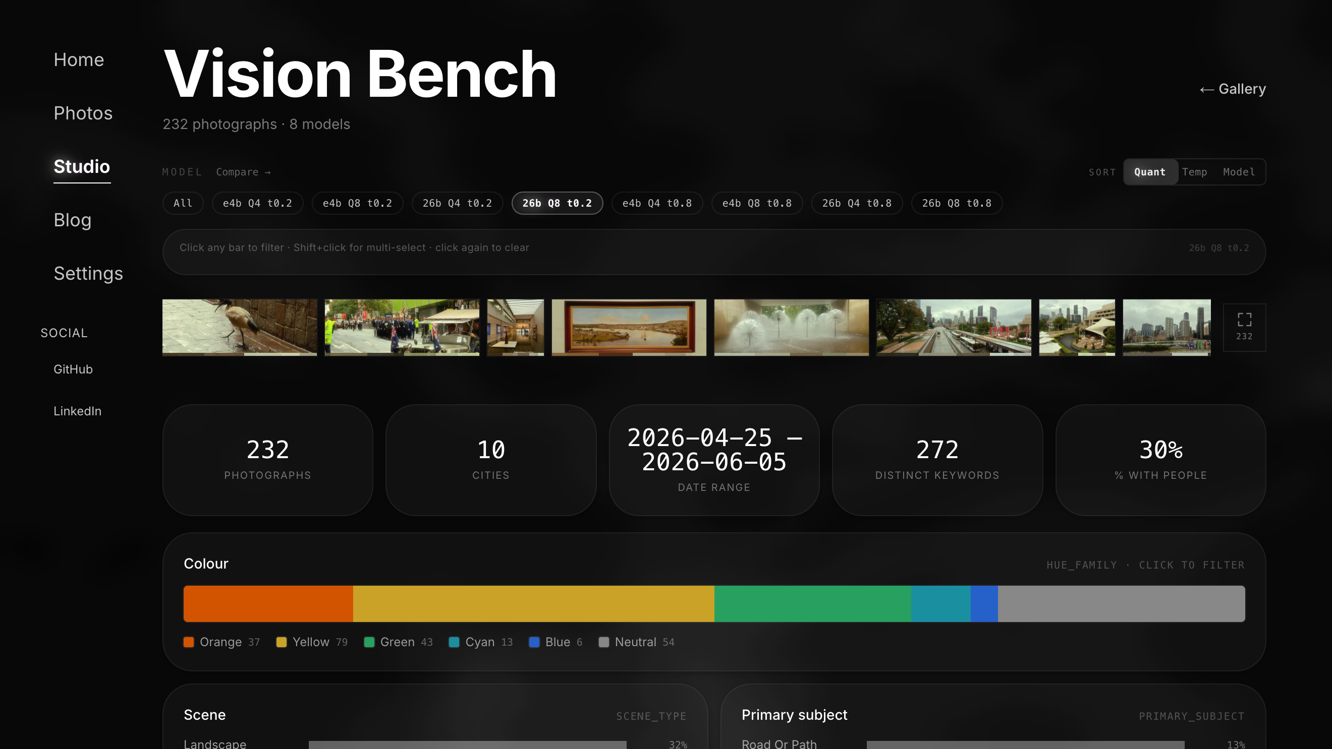
Dashboard contents:
- Cross-filter charts: 19 dimensions, every bar clickable
- Photo strip: fixed-height thumbnails at true aspect ratio
- Colour landscape: every photo as a proportional column of its dominant colours, sorted by hue
- GPS map: clustered pins like the iOS Photos map, with pan and zoom gated behind Ctrl/⌘ so the page still scrolls
- Data lightbox: a per-photo deep dive that puts every model's read of the same photo side by side, differences highlighted
- Library window: a floating frosted window holding all photos in a masonry grid
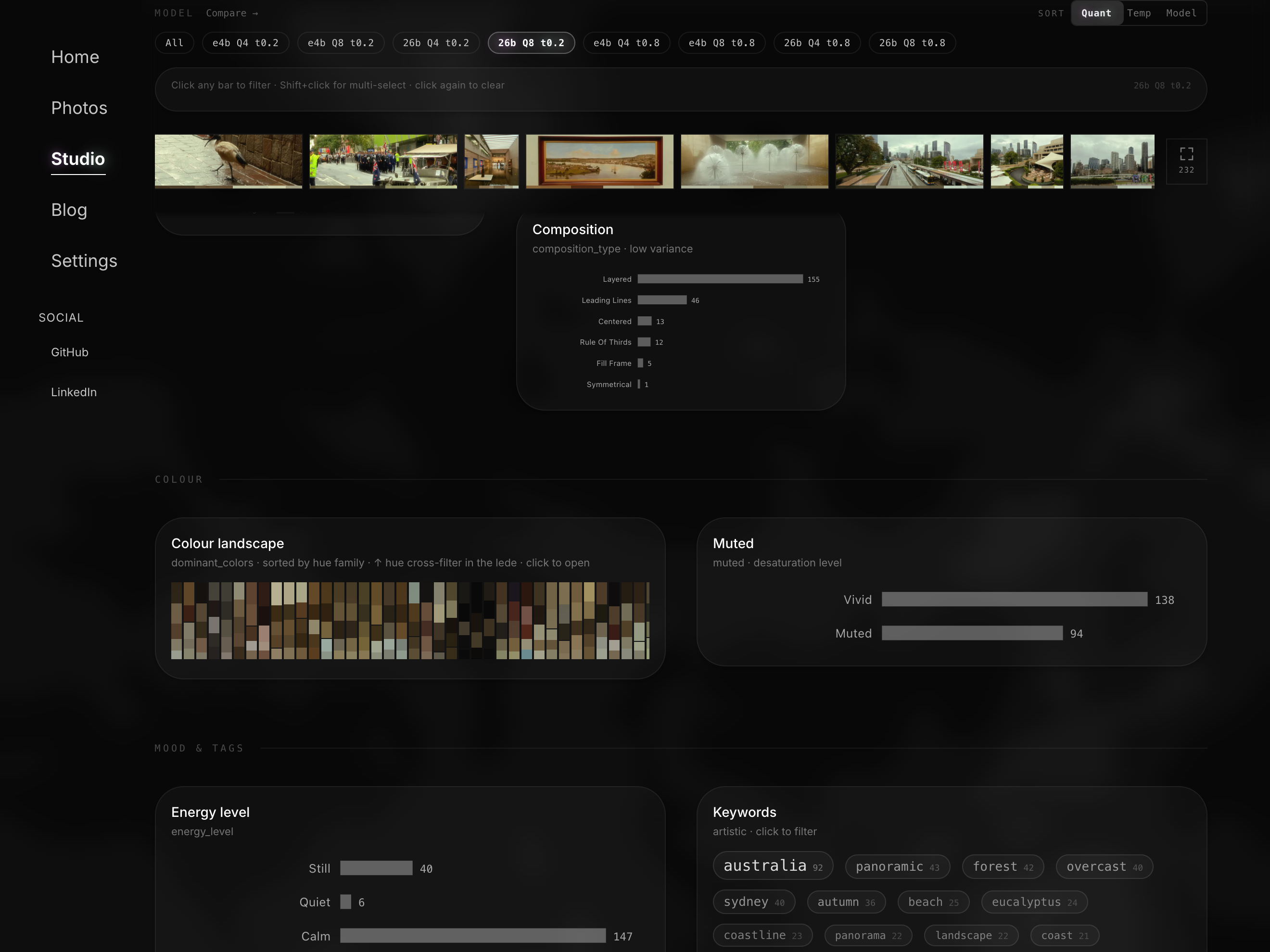
Cross-filtering
The cross-filtering behaviour is modelled on Power BI. Click on a value - like "overcast" - and every other chart, the photo strip and the map get a filter applied so their photos match the selection. The chart you clicked is the exception: it still keeps all of its options visible, only your pick highlighted, so you never lose sight of what else you could choose.
Anything you select shows up in a filter bar as a removable chip, so the current slice is always spelled out and one click undoes it.
The photo fly
Click a thumbnail anywhere - the strip, the library window, the colour landscape - and the photo flies into the data lightbox, then flies back when you close it. It's the same FLIP trick (measure where the photo starts and ends, then animate between the two) as this website's gallery lightbox, just pointed at a data panel instead of a photo viewer.
What it showed me
Cross-filtered, my current sample is strikingly uniform. Most frames were shot between 9am and 2pm, in soft, diffused light. The palette runs warm and earthy, yellows and oranges over blues. More than four in five come back labelled as "calm" or "still". All of this is mostly a property of the sample: landscapes and coastline shot over a few rainy, overcast weeks, and containing few people on purpose, since it was meant for a public site.
What's next
The next round will need to further refine the input: a wider, more varied sample, and better prompts to get a richer output out of the vision model.